
Have a question when using NFORS? You're not alone. Check out our FAQs to see if we have already addressed the issue.
Q: Is there a way to create a ward specific visualization that includes the number of incidents for the ward, and category types for the ward?
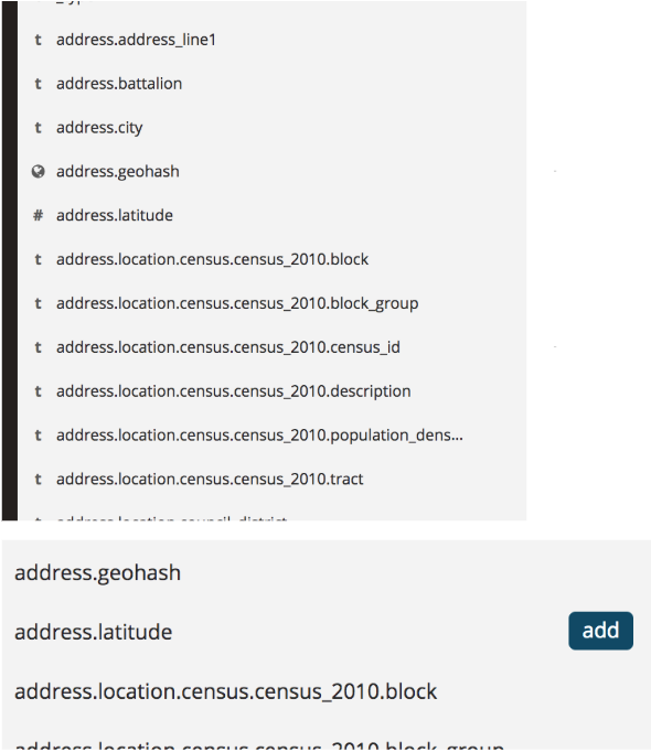
A: The ward data would be stored in the address.location.ward, or address.location.precinct_ward data sets. The address.location.ward is not currently populated, and would require a GIS service or shape file that we can perform an intersection on.
Q: Is there a way to establish specific time filters so that the dashboard will display shift data? For example, if the shift is from 0700 to 0700, is there a way to only display that data? You can set an absolute time, but that doesn’t seem to cover it. The last 24hr is also available, but that goes beyond the time needed. Displaying just the shift would provide the most accurate data.
A: You can create a prebuilt setting for current and prior shifts.
Go to Management, followed by Advanced Settings. Add the following to Time Picker Quick Ranges. Be sure to save your changes.
, {
    "from": "now/d+7h",
    "to": "now/d+7h",
    "display": "Today's Shift",
    "section": 0
  },
    {
    "from": "now-1d/d+7h",
    "to": "now-1d/d+7h",
    "display": "Yesterday's Shift",
    "section": 1
  }
You can double check the “calculated” shift, by confirming the time in the absolute tab.
Note: You’ll have to add this setting for any workspace that you would like to have a quick shift select.
Q: I have only used the internal visualizations and attempted to customize a little, can you provide some ideas of data visualization other departments have built to use.
A: You can check out some more inspiration and techniques at our blog: https://medium.com/statengine. Our last webinar also showcased some other use cases. We will be sharing some more use cases in upcoming webinars.
Q: Can a dashboard be moved between workspaces?
A: Yes, there are instructions at the bottom of this blog post: Organizing With Workspaces.
Q: Is there a way to put a visualization like what’s on the control panel onto a dashboard?
A: No, that is not possible. However, you can build visualizations, displaying the same data in a similar format. For example, build a table with the count of units responses, and sum of commitment time. You could then build a bar chart, graphing turnout time, aggregated by category (FIRE/EMS).
Q: What does the “NOT Suppressed Incidents Hidden” filter mean or do?
A: By default, all calls that do not have an apparatus or units dispatched, duplicate calls, and 911 hang ups are filtered out. You can enable/disable this filter if you wish to see them included in the results.
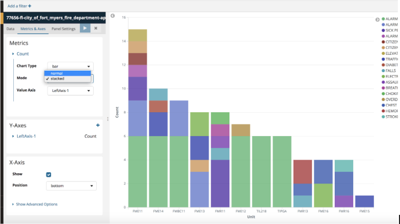
Q: My Call Volume by Unit and Call Type visualizations in my Dashboard are not calculating right. It seems to be counting all the units that responded for an incident? I only want how many of a category type was ran by each unit. How do I fix this?
A: You would need to change the Mode from Stacked to to Normal. This is found on the Metrics & Axes tab. Once you make the change, press play.
Q: Is there a way to view reporting directly on the dashboard?
A: Yes. A saved search can be added to the dashboard to view the reporting next to visualizations.
- On the Discover tab, select the fields you want to add to the table.
- Save the search.
- Switch to your dashboard. Select Add. You may have to select Edit first.
- Select the Saved Search tab under Add Panels.
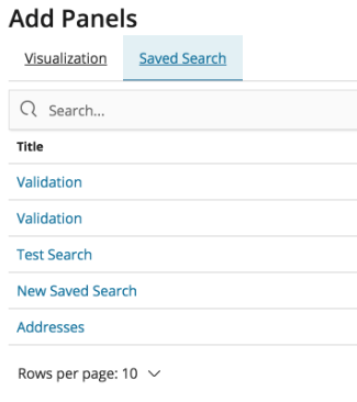
Your search will be saved as a panel on your dashboard. Be sure to save your dashboard once you are finished.
If you have questions we haven't already addressed here, please email us at analytics-help@nfors.org.