
Filtering Your Department Dashboard
The default dashboard provides users with metrics based on department level performance. The dynamic nature of the NFORS dashboard allows users to parse the base response into subsets that allow for more granular assessments.
For example, on any of the charts where units are explicitly called out, such as Call Volume by Unit and Call Type a user can filter the entire dashboard by unit by selecting the appropriate column. This particular graph, also applies a secondary filter, call type. In the example below, the portion of the E1 responses associated with EMS-1 was selected. Since multiple filters were selected, the user has the option of which ones to apply. In this case, the EMS-1 filter is deselected and only the E1 filter is applied.
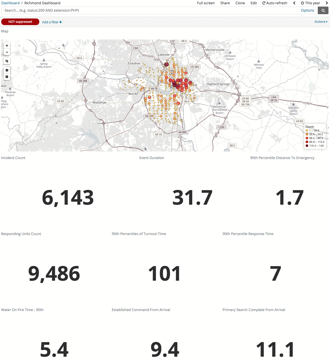
As the filter is applied, the entire dashboard will update, including the map of calls, heads up metrics, and rest of the linked charts.
More Examples
There are several other options that allow similar filtering behavior. For example, if a unit is selected (clicked) from the 90th percentile response times by first due then the entire dashboard with automatically update based on the fire due selection. This is different behavior than the prior example because there is a single filter applied compared to the multiple options in Call Volume by Unit and Call Type. Here we will select 19's first due:
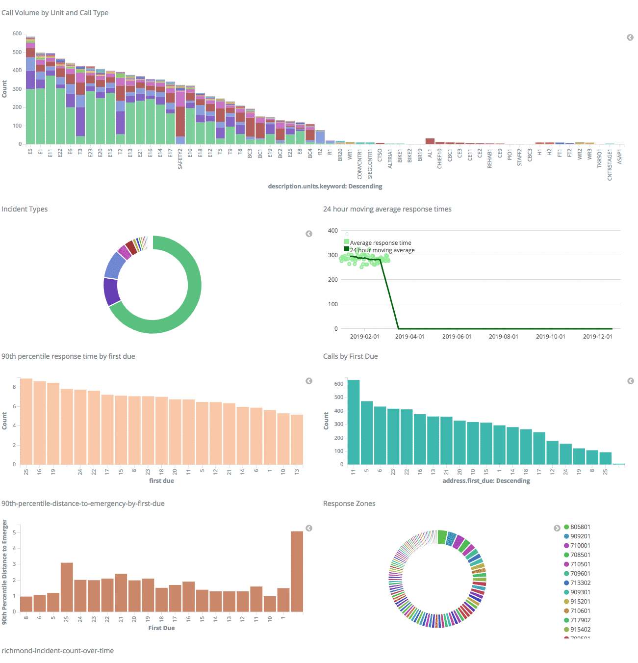
Following the same process, users also have the capability to filter by:
- Incident Type
- Calls By First Due
- 90th Percentile Distance to Emergency by First Due
- Response Zone
- Shifts
- Battalions
- And many other options...
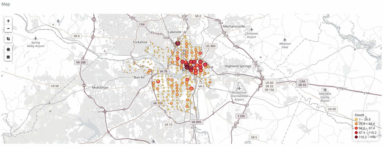
Custom Geospatial Selections
If you would like to select a particular area of a department's respose juristiction but that area is not defined by one of the categories in the linked graphs, a user can create their own area. In the map, select either the square or polygon icon. Once selected, the user can then draw their own shape to filter the data in the same fashion as described above. See the example of a rectangular selection below:
Removing a Filter
To remove a filter hover over the blue active filter at the top bar of the dashboard.

The user then has two primary options for removing the filter:
- Clicking the checkbox to remove the check, will keep the filter in place as option, but will turn off the action. The user can then recheck the box to turn the filter back on.
- Click the trash can icon which will move the filter completely.
Both of these options will return the dashboard to its prior state. Within that same blue icon, the user has options to modify the filter (edit the criteria of the filter being applied), exclude matches (flip the filter), or pin the filter so it can be used later.