
Unit Level Performance
An analysis is performed on each unit within a department's response profile. The data can be filtered as a function of specific time intervals (i.e., last shift, last day, last week, last month, last quarter, or last year) to identify trends and assess performance.
Incident Type Analysis
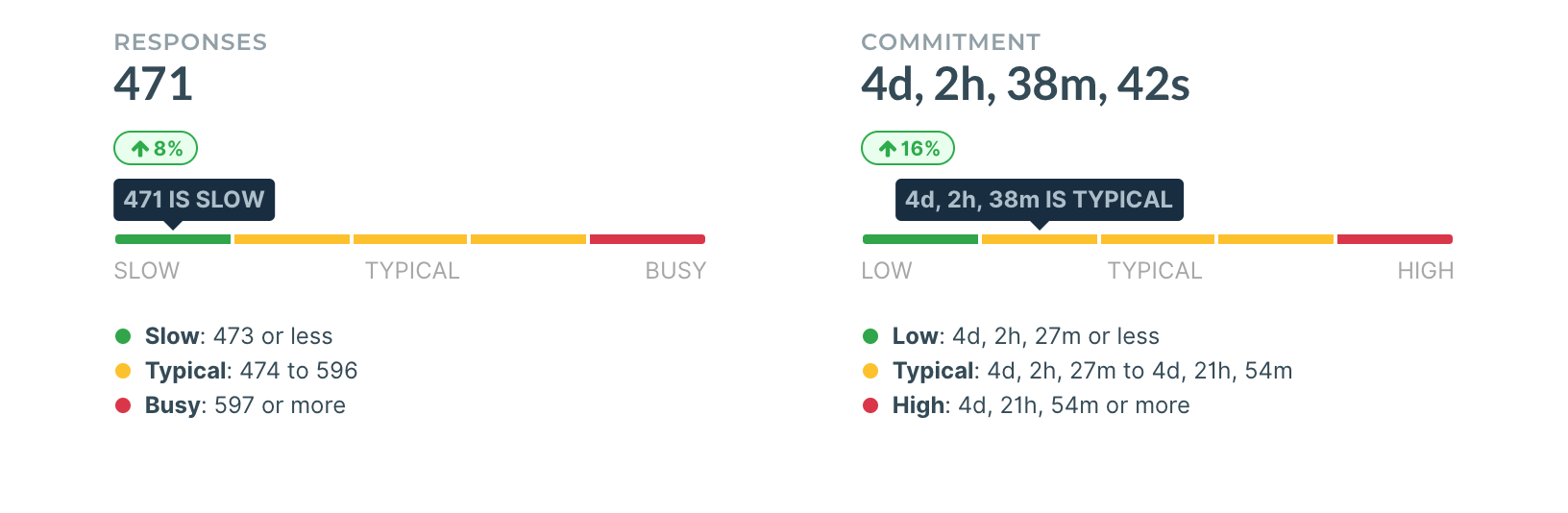
Response frequency is assessed as relative for the selected time window for each unit. Response frequency is assessed as relative for the selected time window for each unit. The data is broken down into 5 subsets to describe the response from slow to typical to busy. The table below describes the ranges.
| Bin | Range | Response |
|---|---|---|
| 1 | 0% -- 20% | Slow |
| 2 | 21% -- 40% | Typical |
| 3 | 41% -- 60% | Typical |
| 4 | 61% -- 80% | Typical |
| 5 | 81% -- 100% | Busy |
As an example, in the graph on the left of the figure below, the 471 responses represents a slow number of responses over the last month for the unit selected. The key below the graph indicates the thresholds for typical and busy response counts for the selected time window.
The graph on the right, shows the total commitment time for the unit during that same selected time window. Here we can see that for the last month, the unit selected had 4+ days of commit. So, depsite the slow number of responses, the time commit still fell within the typical range.
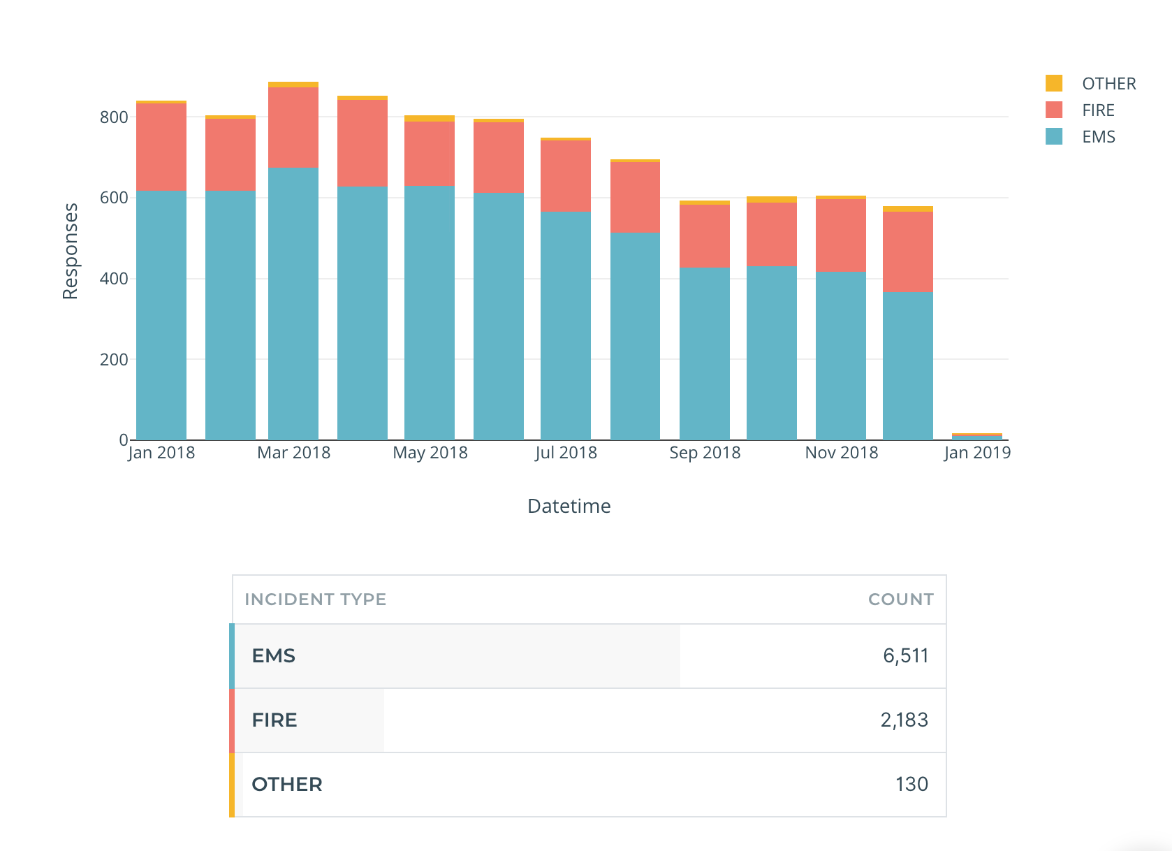
The second analysis is a breakdown by response type for each unit as a function of the time unit selected. In the figure below, the breakdown is again at the month resolution. A mouse over a column will show the specific counts in each category for that column. Finally a table is included which presents the sums in each response category over all the data presented in the bar chart.
Travel Time Analysis
The travel time analysis provides three different metrics. The first, is the overall 90th percentile travel time for the unit over the selected time window. In the example below, the **4m 27s ** response time for all calls and the 17th is the relative rank amongst other units in the department. The side to side arrow means the rank has not changed over the last month. If the arrow were up or down then that unit would have performed better or worse relative to other units, respectively.
Below the overall analysis, is a break down of the travel time into the 90th percentile for each of the EMS and FIRE response. The last visualization splits the travel time for EMS, FIRE, and OTHER into their respective components in a stacked bar charted at the selected time interval resolution.

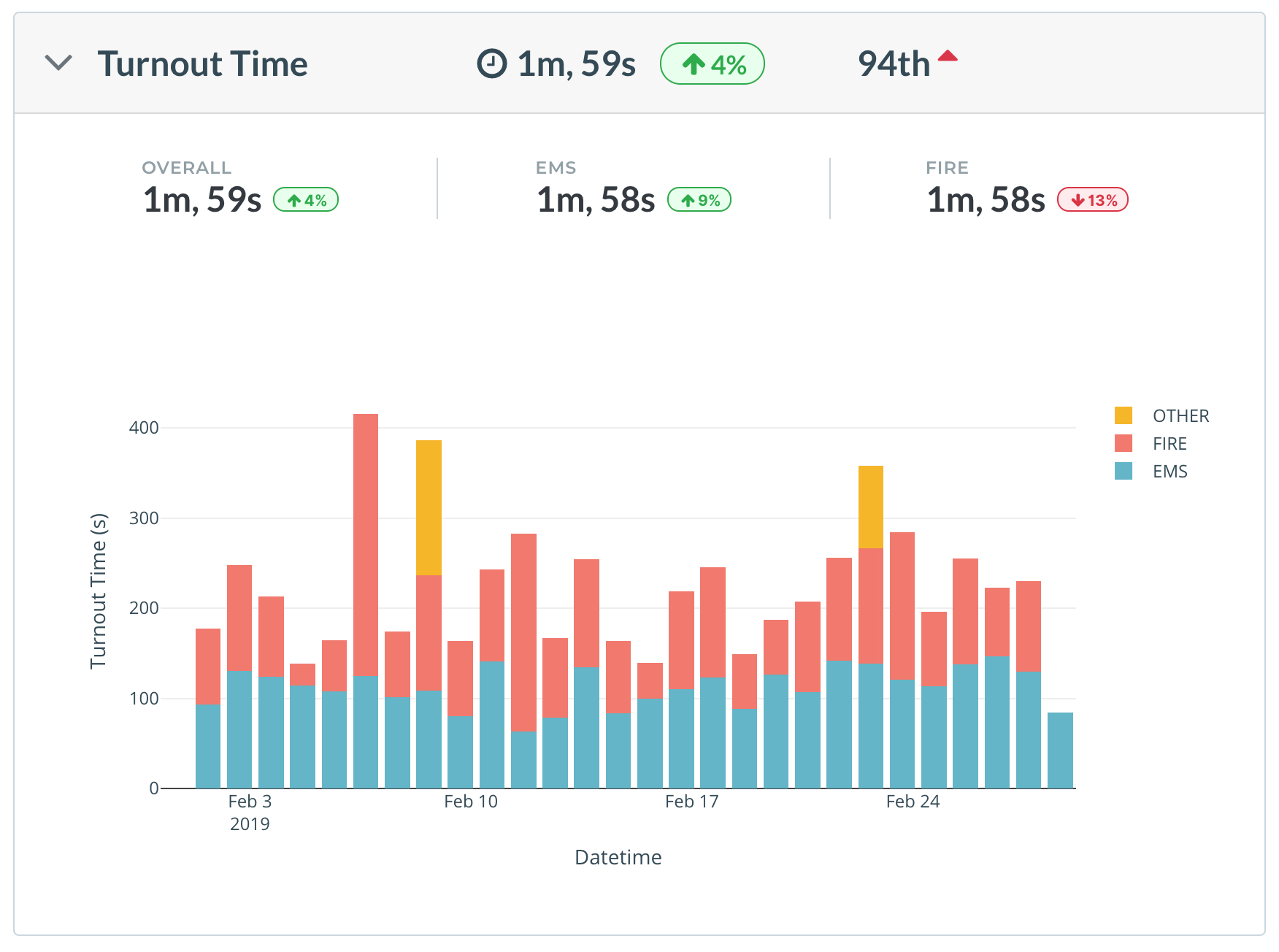
Turnout Time Analysis
SImilar to the travel time analysis, the turnout time analysis presents the 90th precentile turnout time for all calls and the rank within the department. In the example below, the unit has a 90th percentile turnout time of 1m 59s which ranks 94th.
The 90th percentiles are also broken down by call type -- EMS and FIRE with percent changes from the prior time window, in this case the prior month. Again, the last visualization is a stacked bar chart of 90th percentile turnout time by call type.
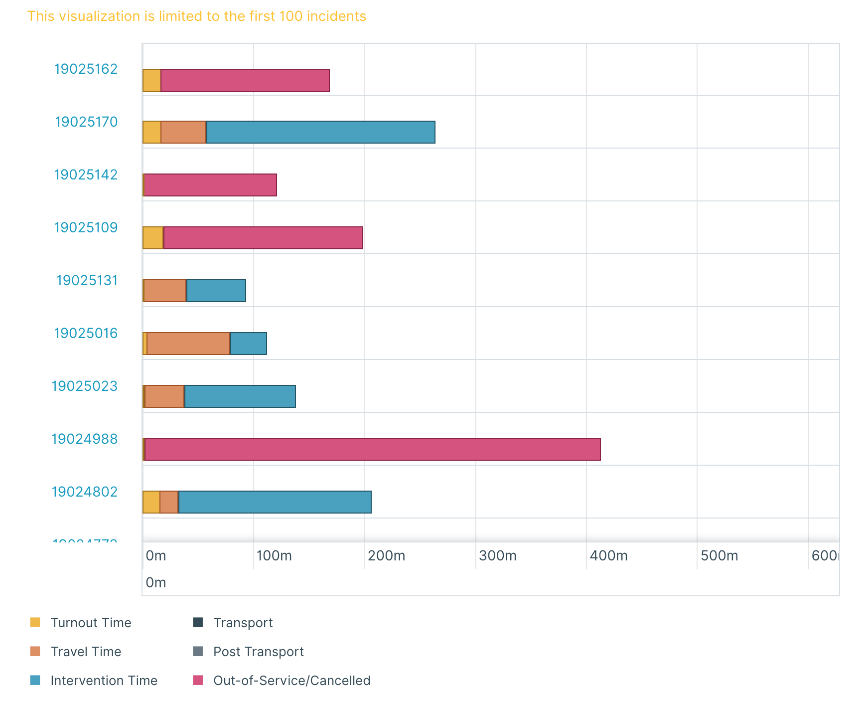
Incident Timeline Analysis
The timeline analysis breaks the portion of the time spent at each incident in one of six main categories: turnout time, travel time, intervention time, transport, post transport, and out-of-service/cancelled. Note these values can be customzied for your department. The visualization below shows a stacked horizontal bar chart that shows the time duration of each component. The incident number on the left hand side is clickable and will take you to the detailed incident analysis page.
General Incident Data
The last piece provide high-level information about the incidents the selected unit repsonded too These values include the incident number, address, category, type, time the incident closed, turnout time, travel time, and total committment time.